About Me Click to read
 Hi. I'm Daniel Nurgitz. I've been called story-teller, graphic designer, web master, photographer, marketer and few other things...but never a sheriff. Welcome to this unusual, but hopefully entertaining Western-themed website. It's my opportunity to showcase some neat web-design tricks I can do while letting people know I'm willing to do all kinds of freelance graphics work.
Some of the things I love most are reading books and telling stories. With both activities, I use my imagination to visualize the story as it progresses. Interestingly, I have found that even with careful written or spoken descriptions, different people in the audience "see" the story in a completely different way. But if a story is told properly, it doesn't matter that each person's experience is slightly different. What matters is that they come away with a clear message or understanding of what happened.
The same is true with graphic design. If a design is done right, it should communicate its message visually and clearly. It's no easy task. My philosophy is to know the audience and give them what they expect to see and then add a little extra something special to get the idea to stick in their heads.
I hope you'll enjoy my tale of the Sheriff of Sans Serif as an entertaining way of advertising my graphical services. Please feel free to contact me to find out how I can help you visualize your ideas.
Contact Daniel and you can also visit my photography site
And I suppose you'd like to see what Services I offer, or have a peek at my Portfolio? Click a link to learn more or scroll down to read the Story of The Sheriff of Sans Serif!
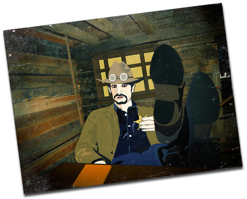
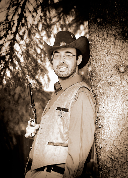
And special thanks to Anthony Jenkins who created the wonderful portrait of me above. Please visit his website to see his portrait, caricature and fine art galleries. Maybe drop him a line and get your own portrait done! Jenkins Draws Site

About the Sheriff Click to read
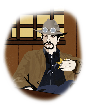
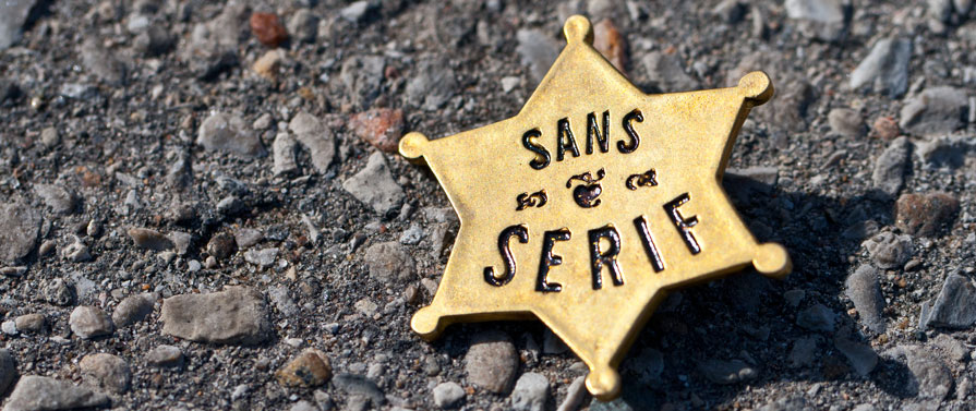
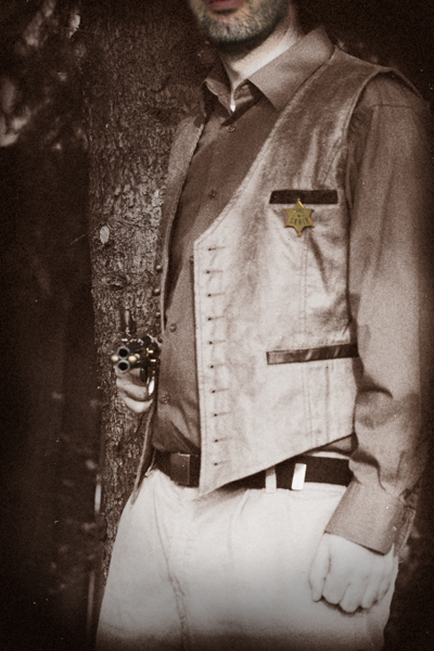
Howdy! I'm the Sheriff of Sans Serif. I'm not a real Sheriff, but I play one on the InterWebs. Maybe, you've seen me around? Settle down and I'll tell ya something 'bout myself.
I'm just a typical Western lawman. Y'know the type - rugged good looks, easy on the eyes. Hard-working. Dependable. I like my coffee black, served piping hot from the chuck wagon in an old tin cup.
Like me, my Story's not too complicated. I'll be truthful, Sans Serif ain't the biggest place you'll ever see. Life here on the Frontier used to be a little more Wild and Unpredictable 'till I cleaned up this one-horse town. It weren't easy at first, but I managed to set down some law and order...and now things are a mite bit quieter.
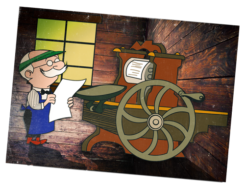
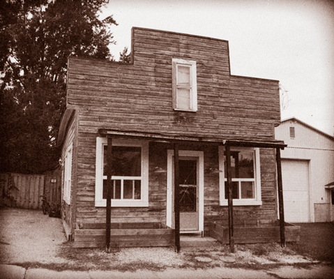
With some extra time on my hands, I started helping out ol' Pete at the Print Shop. He taught me how to set metal type and design everything from fliers and posters to business cards and books.
For 10 Years, I worked hard to achieve the high standards that Pete's customers expected. And there was more to it than just designin'—there was figurin' out how to take ideas and communicate them through printed media. Some call it marketin'. Folk said they liked my design, so when ol' Pete moved his last piece of type, I continued working in the Print Shop. And I'm still doin' my Sheriff'ing on the side. These days, you might say that I Enforce the Law of Good Design.
Come on over to my Print Shop and check out our great services!
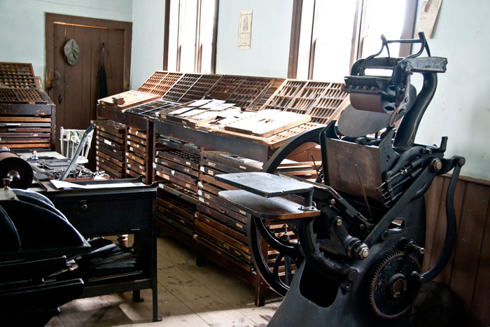
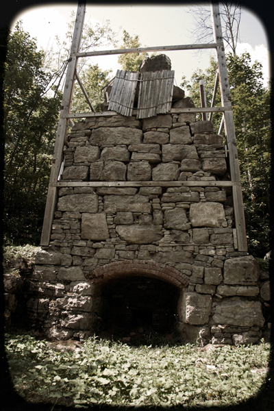
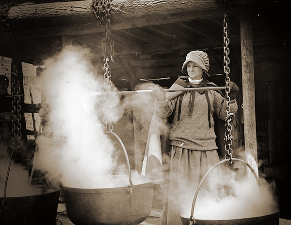
This here is the ol' printing press
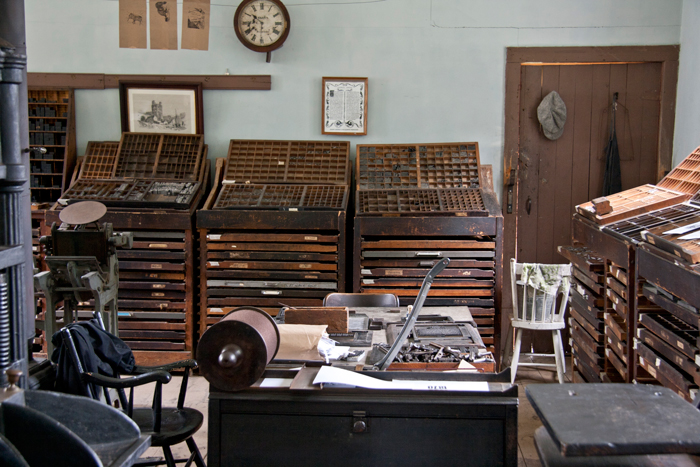
See all those little shelves and drawers? That's where we stored the metal type for printing letters
WAIT! WHAT IN TARNATION IS A SANS SERIF?
Here's a little Typography Lesson:
Typefaces or Font Families can be divided into two groups: Serif and Sans Serif. Serif Fonts have little decorative feet, crossbars, or endings. Sans Serif Fonts are plain. In French, "sans" means "without", so these Typefaces are without serifs or without decoration.
Print Shop Pete will help illustrate:
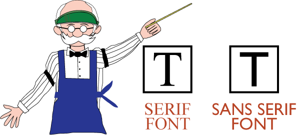
See the difference? Another good thing to know is that Serif Fonts are supposed to make large amounts of text easier to read. Sans Serif Fonts are handy to use for headlines.
Hah! That'll learn ya! Now back to the story.
THE STORY CONTINUES:
I thought I had straightened out all the trouble in town but I was wrong. During my shifts at the Print Shop, I discovered evidence of foul play of the bad design kind.
Someone had been using a strange, new Typeface in an inappropriate way. This new font was absurdly childish and irregular and it was being used in serious signs or professional documents--places it did not belong! It soon became my mission to track down the source of this bad design and put an end to it.
MY NEW MISSION—TYPOGRAPHIC ENFORCEMENT:
Through my keen detective skills, I managed to piece together a sequence of mysterious events to figure out this puzzle. A newspaper report from Cobalt City claimed that a rodeo clown had gone rogue...
Too long; didn't read?
Summary:
A rodeo clown goes rogue and creates a typeface that is being used inappropriately. No one takes the message seriously because the font is too cutesy and childish.
TO BE CONTINUED...
